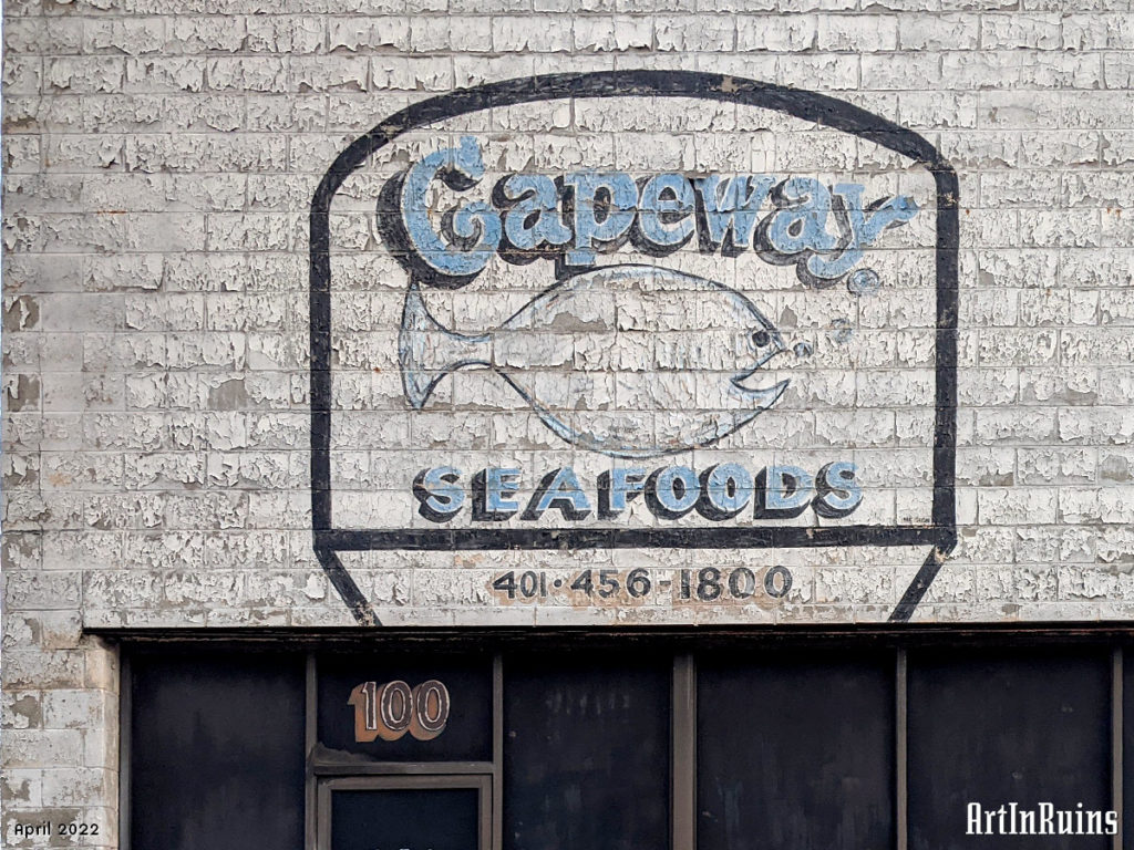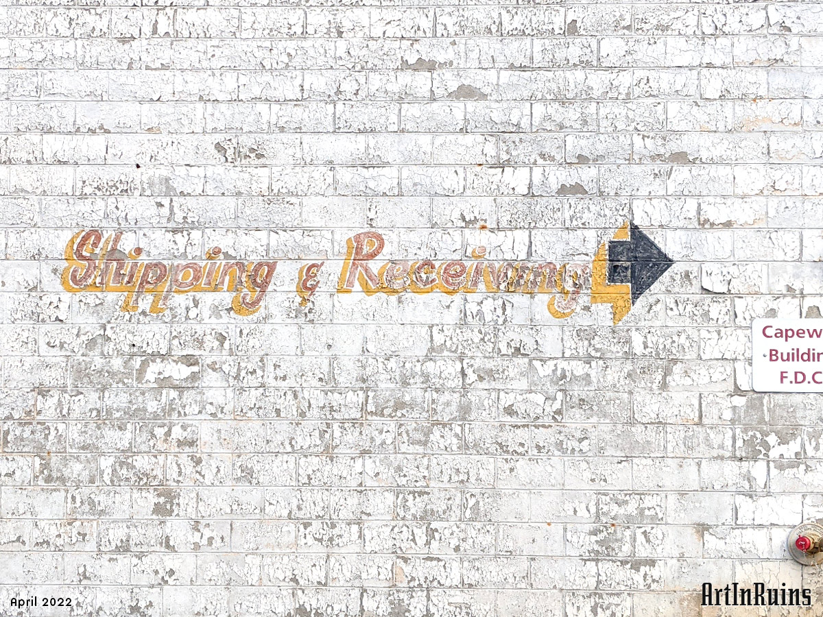
This crumbling sign adorns the upper half of a building near the Hospitals. Its lovely “Capeway” typography in light blue and shadowed with black is a loopy, soft serif style while the “SEAFOODS” portion is a non-nonsense sans-serif all caps with some hand-painted variation in the letters, particularly the two Os. A simple fish shape is drawn in between the words with a few bubbles coming out of the cartoon mouth.
The number 100 painted on the transom over the main entrance door is lovely as well. The numbers are outlined in white with what looks to be a maroon center, with a deep yellow-gold shadow to the left and below.
Photo submission by ArtInRuins.
